Two-Tone Doors and Bold Colour Ideas That Still Look Elegant
White and wood-tone doors will always be safe choices, but many homeowners now want something with more personality. Colour can transform a hallway or a bedroom, and a two-tone door adds interest without needing any extra decoration. The key is restraint: bold does not have to mean loud.
Understanding two-tone doors
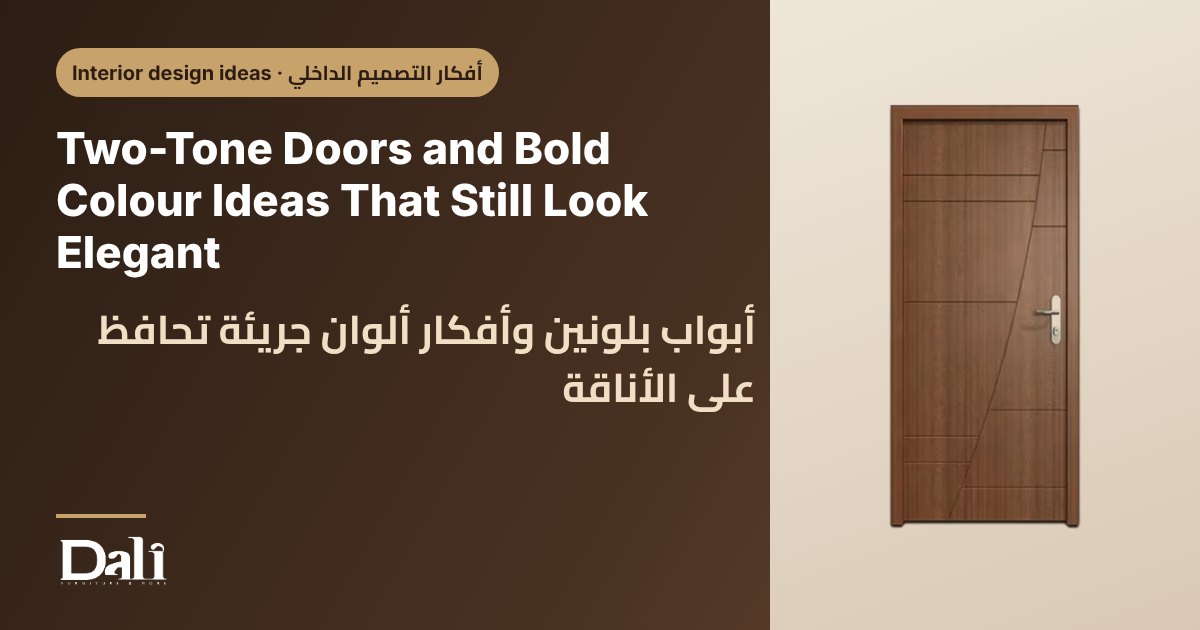
A two-tone door uses two colours or finishes on the same leaf, or different colours on each side. A common idea is a dark colour on the room side and a lighter one on the corridor side, or a wood-effect surface combined with a painted panel. Another approach is to keep both sides the same and instead paint the frame in a contrasting shade.
Two-tone doors work best when the two colours share the same undertone, such as warm grey with warm wood, or cool blue-grey with white. Mixing a warm and a cool tone can look accidental unless it is done carefully.
Bold colours that tend to stay elegant
Deep, slightly muted shades usually look more sophisticated than very bright ones. Instead of a pure primary colour, think of tones with a touch of grey or earth in them.
- Deep green or olive: calming, pairs well with wood furniture and brass handles.
- Navy or ink blue: formal and strong in studies and reception areas.
- Terracotta and clay: warm, suits sunlit rooms and natural materials.
- Charcoal and graphite: modern, works well with light walls and simple handles.
- Soft sage or dusty blue: gentle options for bedrooms and kids' rooms.
Where bold colour works best
You do not need to colour every door. A few well-placed accents are more effective than a colourful hallway with too many competing shades.
| Place | Idea | Why it works |
|---|---|---|
| Home office | Deep green or navy | Creates a focused, calm feel |
| Master bedroom | Soft sage or muted blue | Relaxing and restful |
| Kids' room | Warmer, friendlier tones | Playful without being overwhelming |
| Entrance hall | One feature door in a bold shade | Sets a confident first impression |
Finish and material matter
The same colour looks different depending on the surface. Painted finishes give the richest, deepest colour and can be repainted in future. Melamine, HPL and PVC come in a range of solid and textured colours that offer easy care; HPL is usually valued for durability in busy areas. Matt and satin sheens make dark colours look refined, while high gloss can look dramatic but shows marks more easily.
Remember that colour on a sample can look different at home. Natural light in Egypt is strong, and a shade that looks soft in the shop can look brighter in a sunlit room. Test a sample against your wall in morning and evening light before deciding.
Keep the details quiet
When the door has a strong colour, let everything else stay simple. Choose handles in black, brass or brushed steel, keep skirting boards neutral, and avoid adding patterned wallpaper right beside the door. If the door is dark, a light wall behind it creates a clean contrast; if the wall is dark too, a door slightly lighter or darker than the wall looks sophisticated.
How to choose what suits your home
- Light: in dim rooms, avoid very dark colours unless you want a cosy, dramatic look; in bright rooms, deeper colours feel balanced.
- Limit your palette: two or three colours across the home is usually enough to feel intentional.
- Humidity and wear: pick PVC or HPL for bathrooms, kitchens and busy corridors, where easy cleaning matters.
- Family: darker matt surfaces show fingerprints; consider this with young children.
- Budget: painted feature doors in a few key rooms give impact without changing every door.
- Resale and change: neutral walls and a bold door are easy to adjust later.
Browse the Dali shop to explore colours and finishes and find the combination that suits your home.